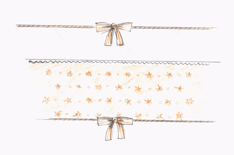
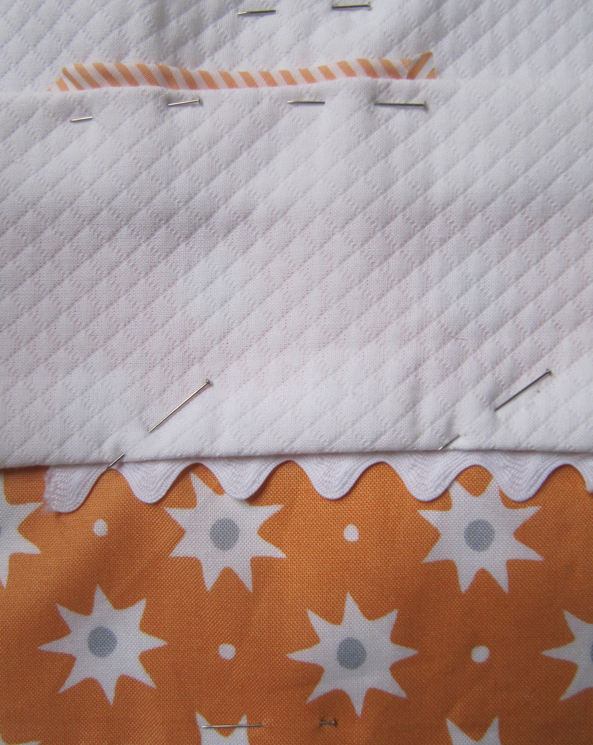
There are times a designer misses the concept of what a client is looking for. This is a fine example. I thought the customer would be as excited as I was about this concept. Great clients. Wrong concept. It mixes touches of blues and oranges with a neutral cappuccino color. The carpet in this NYC apartment is a Stark neutral. It will remain. The customer is pretty firmly traditional, but would like a more modern nursery. The carpet looks like this..
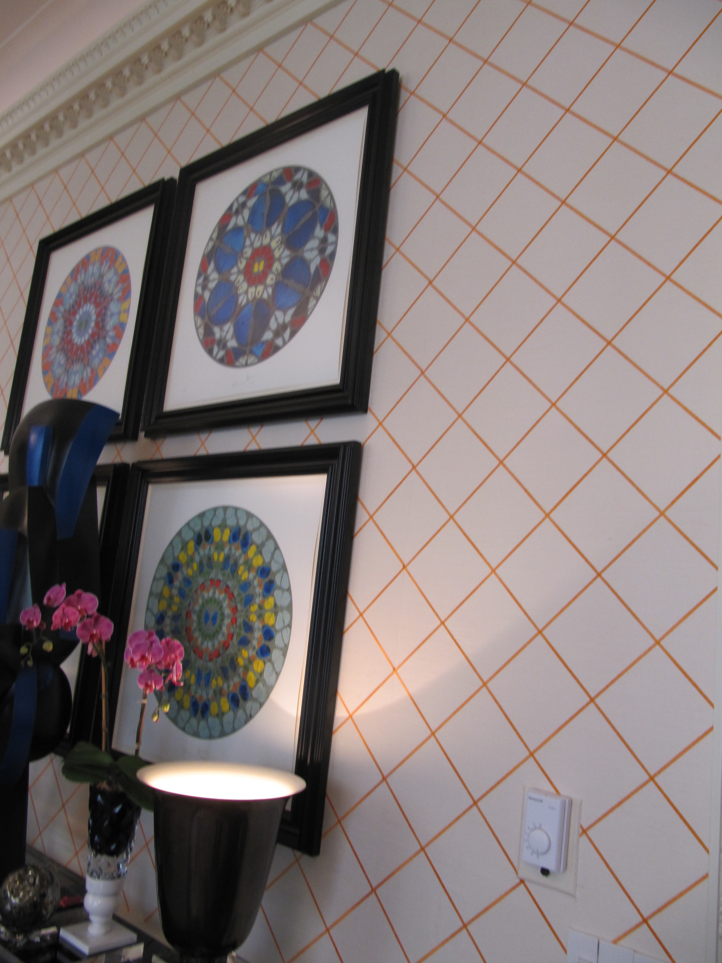
I wanted to use a grasscloth wallcovering that had a delicate orange trellis.
After I chose it, I saw it was used in the Kips Bay showhouse, in a very large room. As you can see the pattern is not overwhelming.
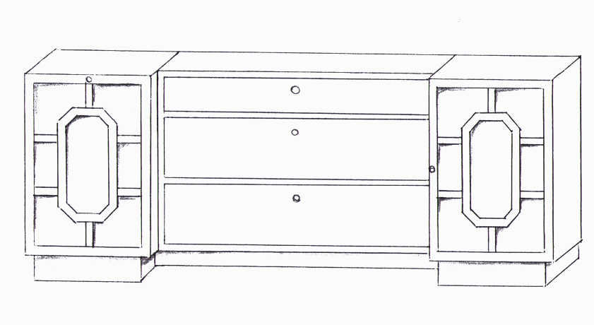
I designed this long changer finished in white lacquer. It had closed storage on the right side, drawers in the center and a hamper on the left side. Each piece would come apart and be completely painted. This would allow for future flexibility. Later on, one could use the hamper and dresser in different parts of the room, for example.
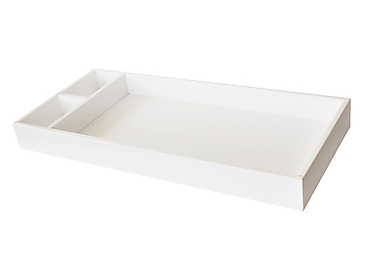
On top of the changer we would affix this standard tray.
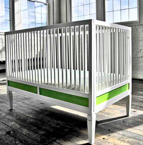
The crib is very clean, but still maintains it's traditional roots. It would be entirely in white.
The glider is the classic glider that I have in the shop slip covered in a linen. The bedding would have dashes of blue and orange. Pic of the side of bumper is below.
Fabrics would be a thin orange stripe piping and ties with white matelasse and Annette Tatem soleil orange fabric that is separated by a large ric rac lace.
I wanted to use a 7' round rug that would achor the room.If the baby was a girl it would be this one.
A boy...
Possible artwork. Vintage educational posters...
Although the client decided not to go in this direction. The ideas will remain in the Cici Crib library....
See you...
Christina

