Just a sneak preview of the before and after of my townhouse in the Mexican War Streets in Pittsburgh. It's nice to be settled in!
Your Custom Text Here
Just a sneak preview of the before and after of my townhouse in the Mexican War Streets in Pittsburgh. It's nice to be settled in!

I have been so remiss in posting to my blog lately. I do apologize. We have had some structural issues going on in my Pittsburgh townhouse renovation. Everything is finally moving forward and I will post on the progress soon. In the mean time I have been busy baking at the beautiful Senti Restaurant and Wine Bar and decorating for clients in Pittsburgh and New York. It's a crazy life.
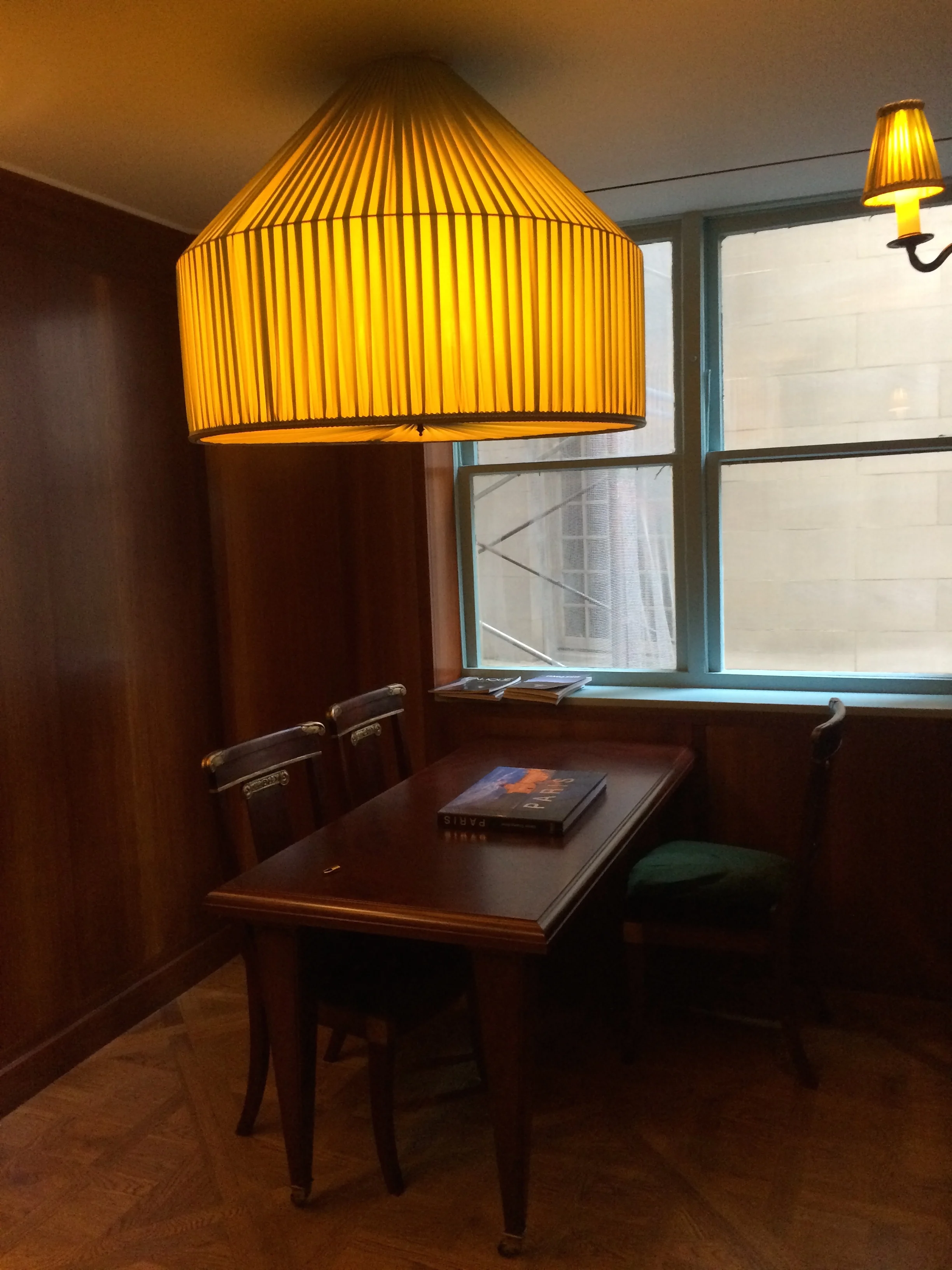
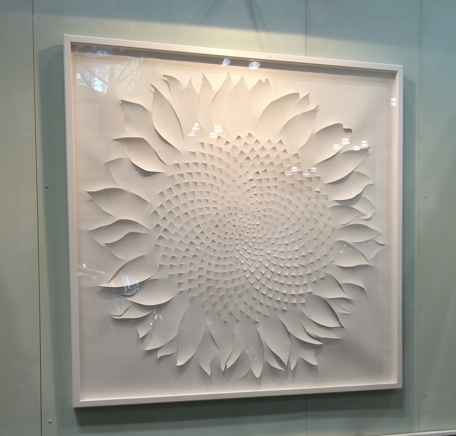
Last month I was able to swing by Kips Bay Decorator Show House in NYC. The nation's best interior designers participate in Kips Bay. There are tons of blog posts about the rooms. I want to focus on details. So here's a list of some great decorating details.
Alex Papachristidis' Salle a Manger Glamour:
A beautiful place setting,:
Interesting Pillow combination on the sofa:

The fabric and trim on the lamp shade:

Suzanne Kasler "sophisticated simplicity" sitting room used an upholstered a panel used as a decorative wall feature.

Victoria Hagan's " American Dream" living room upholstered the sofa in two contrasting fabrics.

David Kleinberg's Library installed some show stopping sandblasted pine bookshelves:


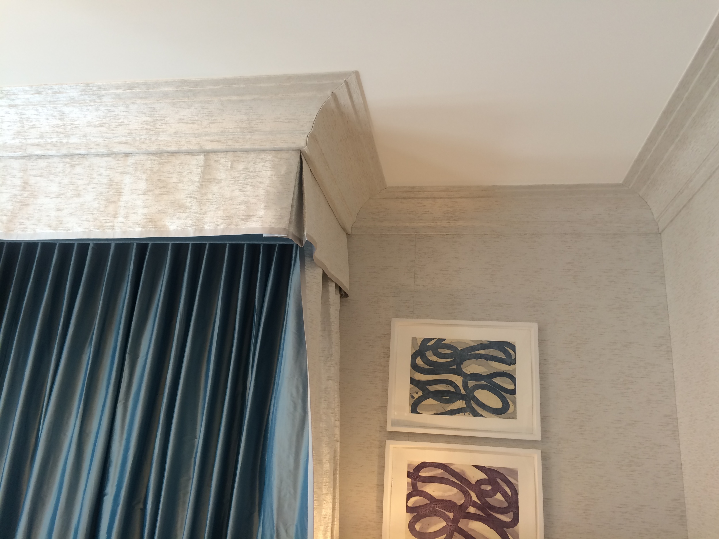
Jamie Drake's "Master Floor Library" perfectly upholstered cornices and trim!:

Benjamin Vandiver's "Ascension" had an original combination of this light fixture and wall covering. So fantastic!:

Timothy Whealon's "white orchid room" was just lovely in every way. Soft window treatments and an inviting nest of a bed. A wonderful escape from a busy life!


See you!
Christina
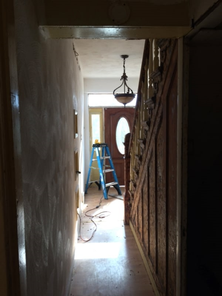
The house is starting to feel more like a house than a construction site. Well sort of anyway. Walls are being smoothed out. Tile is down. The wood floorand entry tile on the main floor has been laid.

In keeping with my concept of a light, bright ,warm space, I decided on a white washed oak floor. There are purposeful imperfections- a shabby chic floor for sure. I didn't want the floor to look shiny new next to the well worn staircase. I know the white floor is gutsy design decision in this historic district. It will be laid next to the staircase which will be stained as dark as possible. I love that contrast!
The lovely entrance floor above, a beautiful marble from Italy, is a Walker Zanger tile. I purchased the tile at Tile and Designs in Shadyside. Their selection of tile is exquisite.
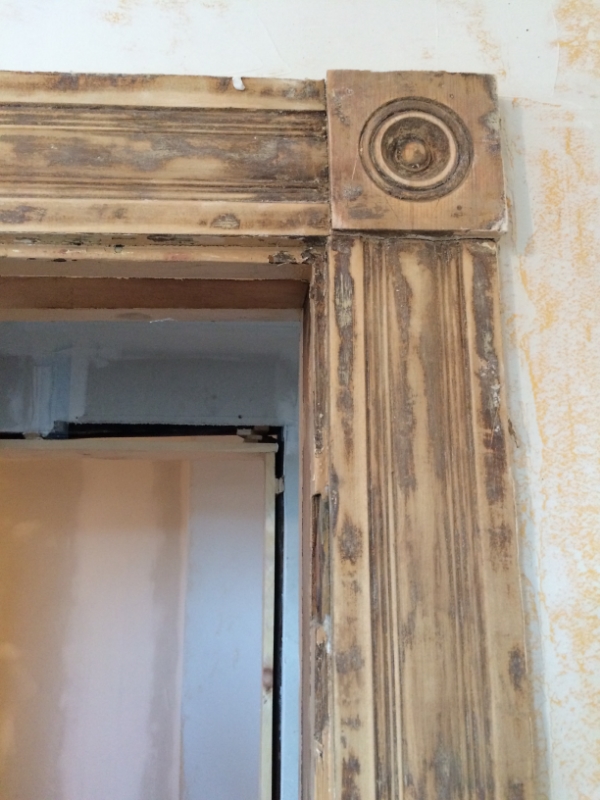
Most of the trim and casings in the house were removed after the many renovations that occurred over its life. There is a bit left. The pic below shows the original casing that is in the process of being stripped and sanded.
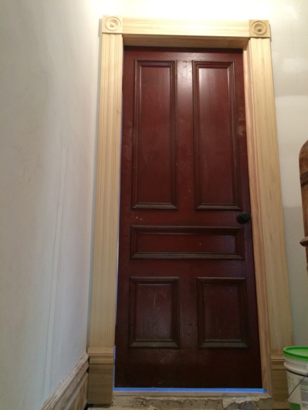
I found new casing and rosettes at Allegheny Millworks in Pittsburgh. It isn't exact match, but I felt it was close enough. I can just hang outand check out all their beautiful woodwork at Allegheny Millworks. I love that place.

I found this beautiful cherry trim for the first floor. It's chunky and gorgeous.

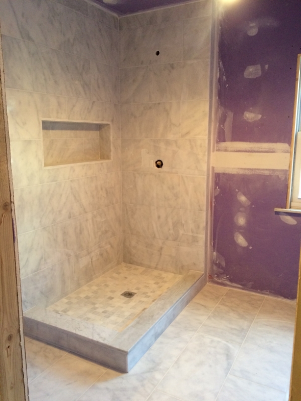
The master bath tiling is complete. It is all in carrera marble.
Exterior work is going on as well. The new siding is going up on the back of the house! I decided to use Hardie Plank siding. It's a great alternative to wood. I chose the Hardie color of cobblestone for the siding with white trim. Here is a pic from before. Notice the very dangerous balcony. The house inspector refused to step on it.
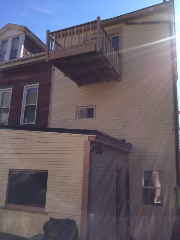
The balcony is now a Juliette balcony and all siding and windows are new.

Well that's about it for now. Thanks for looking.
See you...
Christina
I was back in NYC looking at a clown shoe collection while work was progressing on my Pittsburgh townhouse! I was sourcing some stylish accessories to decorate a Madison Square Park duplex, but these didn't quite make the cut, unfortunately...


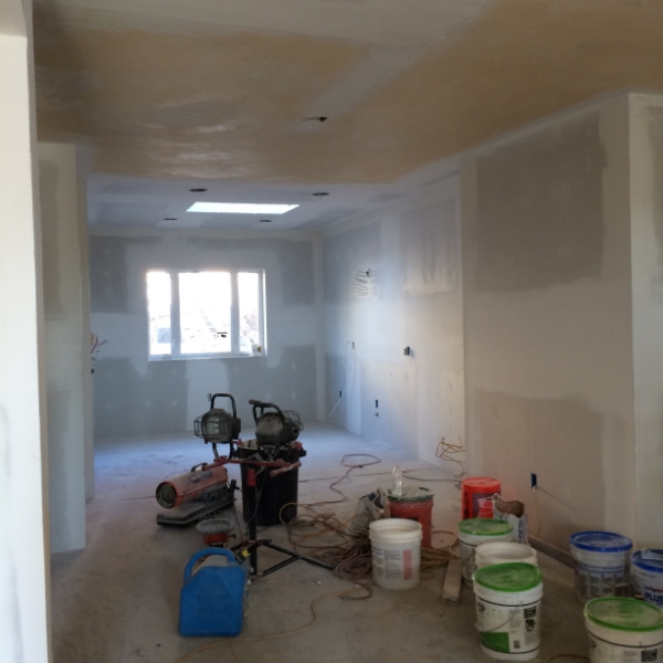
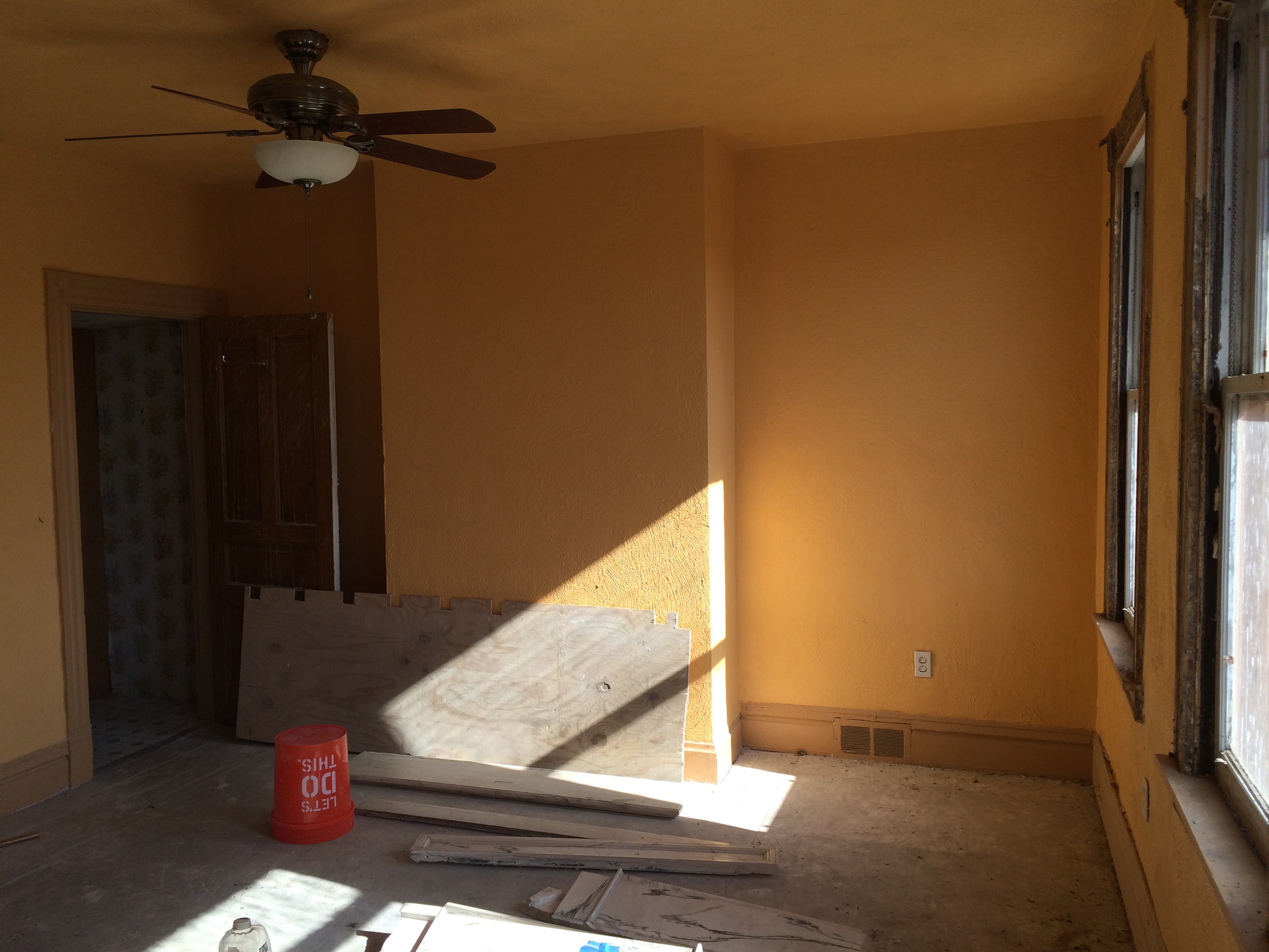
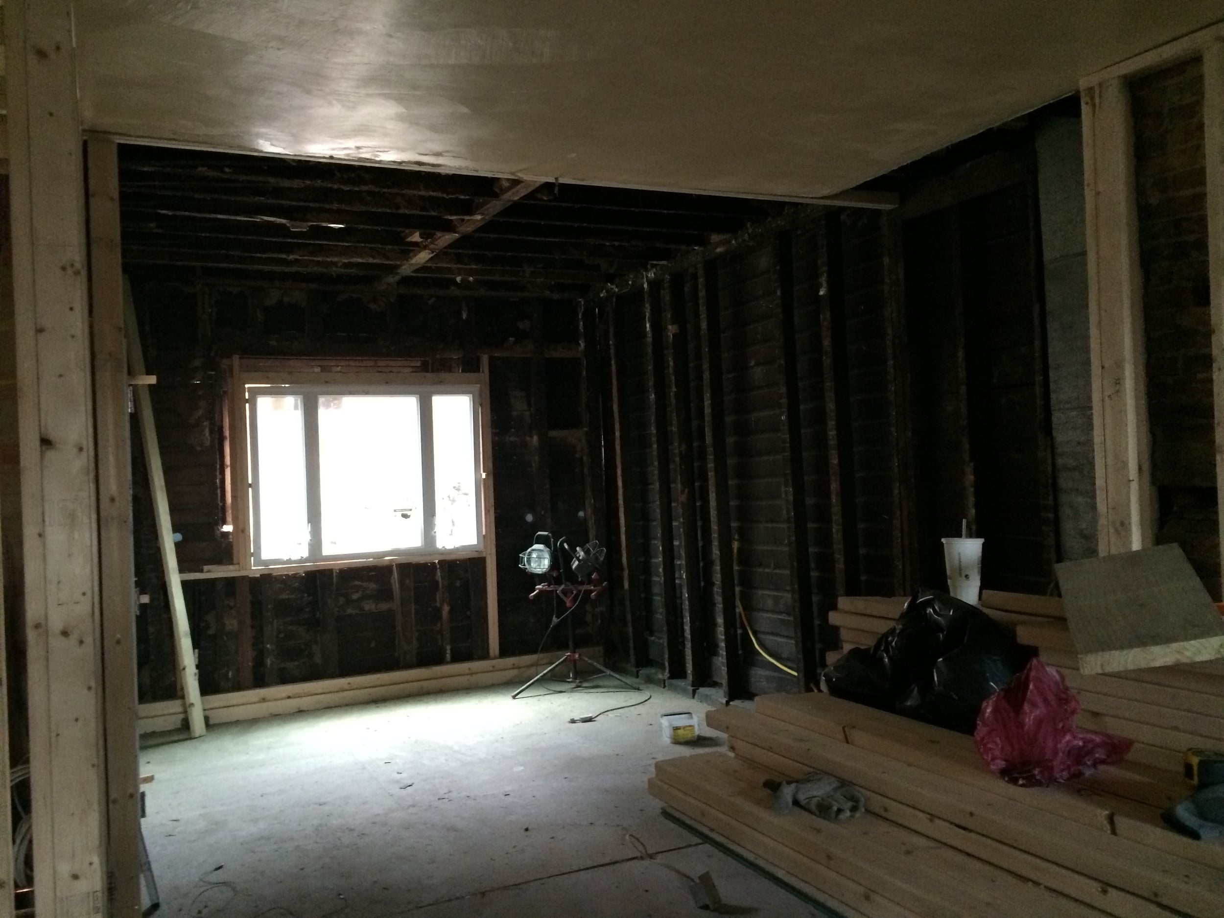
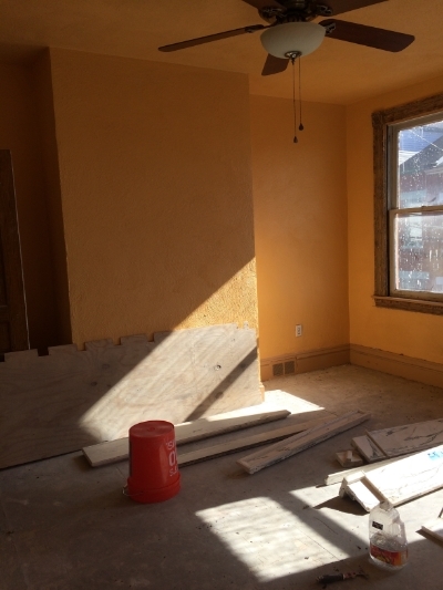
Back to the renovation- It's moving at a fast pace now. All the dry wall is up and the mudding is in full swing. I expect this part of the project to take forever since most of the house was covered in popcorn. Not only popcorn ceilings, put popcorn walls! Lots and lots of skim coating!
One of my favorite spaces is the kitchen. I love to cook and bake! It is not a large space and so architecturally insignificant as most kitchens were in the 19th century. I wanted it to be the center of the living space. This is what it originally looked like.


We completely opened it up. The ceiling was a bit of surprise. We thought it was a standard height. Once the demo started we realized we could raise it to the height of the rest of the first floor which is about 9'. Now it is an integrated space. Light flows in from the larger window as well as the sky light. All the "lovely" stone was removed and sheet rocked.

We removed that large awkward window in the living room below. It was replaced with two proportionately sized sash windows.
Now the space is completely open and light. Behind the staircase we snuck in two closets. A coat closet and a pantry. Closet space in these townhouses are rare. I would love more storage, but I had to be mindful of the petite, narrow proportions of the house itself.


In the above pic, I found an antique door for the powder room. The knob is black porcelain. LOVE it! It will all be painted white.
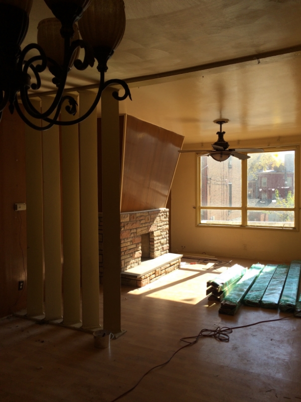
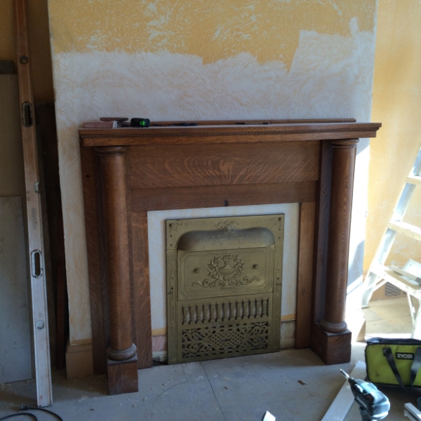
The second floor build out is also coming along. The master bath is comfortable , but kind of small . I am still getting used to smaller spaces. Life in suburbia was so much more breathable. The laundry room and walk in closet is built out. The only significant change to the master bedroom will be the installation of a mantle. The fireplace in the master bedroom was dry walled over at some stage in it's life. The pic below has a long piece of plywood in front of it.
I didn't want to open up this fireplace. That can be a can or worms in this old house. But I like the idea of the fireplace in the master. I found a mantle that came with a gas insert and summer cover. The gas insert was made by the Dawson Brothers at the turn of the century. So now it is a fake fireplace. Anyway, it needs to be finished out, but in the mean time I think it looks really nice.
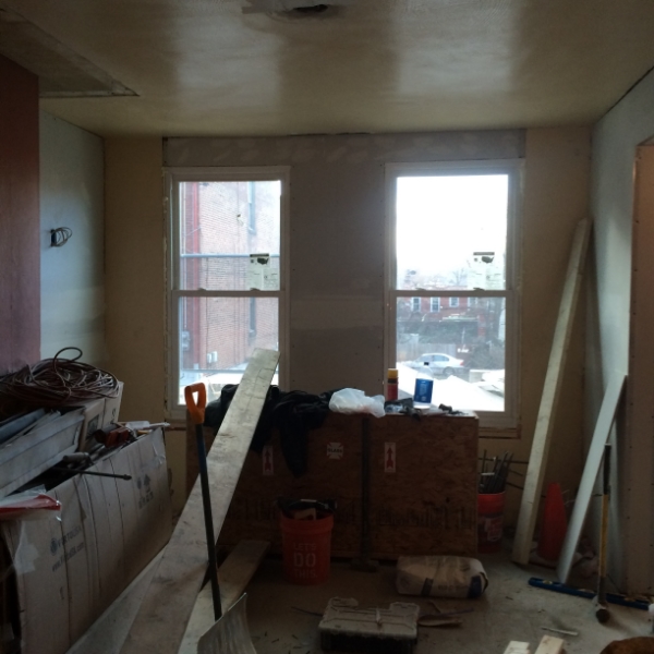
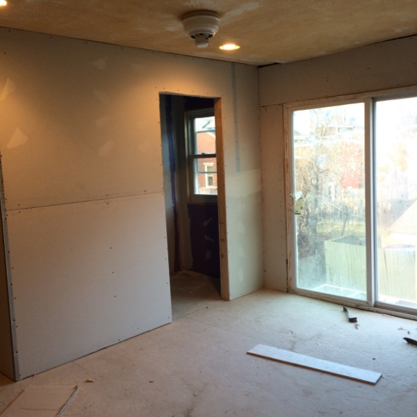
The third floor kids bath seems very spacious as we enclosed the weird opening of the original space.

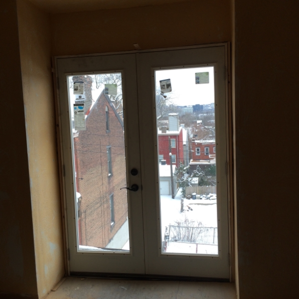
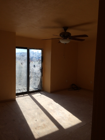
The only change to my office was the removal of the slider. We put in a french door that has as much glass as possible to take advantage of the wonderful views of downtown Pittsburgh.
That's it for now!
See you...
Christina
Happy exciting new year! My house is progressing. I am beginning to see how it will be translated into a beautiful living space. The demo is just about done and construction has begun. One of the main reasons I purchased this house was it's layout. Not much needs to be changed in terms of bathroom and kitchen utility placement. Walls have to be created and some spaces opened up a bit. But that is about it in terms of major construction. The first floor was pretty much an open plan. But the living room looks much larger without the mammoth fireplace.


I wish the original mantel was in place. But it is gone like most of the special features of the house. I found a vintage marble mantel at Construction Junction that I really like. It definitely isn't Victorian, but I think it will work just fine. This is the only photo I have, before it was dismantled. By the way, I wish there was a Construction Junction in NY, it is really what House Wreckers in Stamford, CT used to be like. Everything pulled from old houses. The ultimate recycling. There are many treasures to be found. It just takes patience.

Back to the layout. The living and dining will be designed into an airy, but warm environment. The kitchen and dining area opened up very nicely. The kitchen used to feel like it was on a back porch. It may have been in it's former life. But now it will be completely integrated.

The kitchen faces north. Not only did we put in a larger window, but a skylight will be installed to bring in more light.
We will save the staircase paneling where we can. But there looks like there were about ten coats of paint on it. So stripping all that paint was enormous.

.
The newel post looks great. It came out very nicely. Eventually, I would like to see it in a very dark stain.
Well that's it for now. Hope you also are seeing the progress of this design project! I know it looks daunting, but it is really coming along!
See you...
Christina
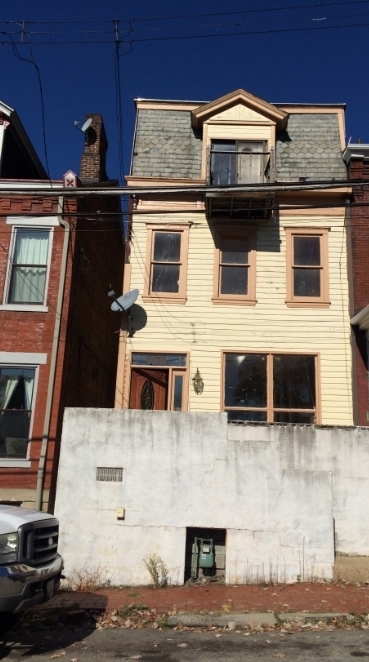
This past summer, I bought a fixer upper in Pittsburgh. I am excited to share my journey to renovate,redo and decorate it. Since my life has changed so dramatically in the past two years, I yearned for a home that is filled with light, warmth and comfort. I don't want a fancy house anymore. I want a welcoming yet peaceful place for family and the pets. It will not be a Victorian reproduction. I wanted a clean open layout, while respecting the original elements. Unfortunately most of the original features were destroyed by it's previous owner. We will keep what we can.
First about the location. It is in the Mexican War Streets. A quaint, but funky neighborhood in the northside of Pittsburgh. The house is one of many 19th century town houses that were mostly upper middle class and middle class homes. Many of the homes in the war streets are quite grand. My house is well built, but lacks many of the beautiful features. On the flip side, because it doesn't have a strong architectural personality, it allows for a more flexible design vision. Needless to say, all design decisions will all be constrained by both my budget, as well as what the neighborhood can handle in terms of value.
The following pics were taken when I purchased the house.
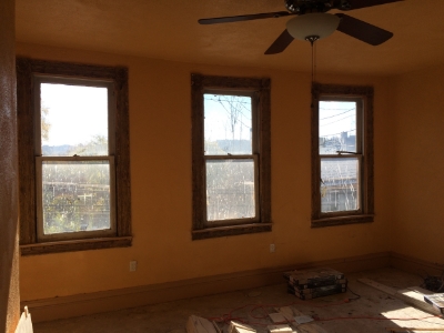
Here is the front foyer:


Living room:

The mammoth 1970s fireplace. I wonder what the original looked like. Floors are all laminate.

Dining room and kitchen
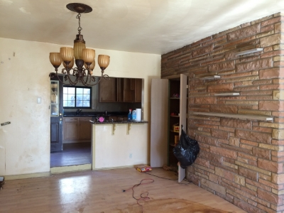
Kitchen

Master bedroom
Back bedroom and odd bathroomish space. This space will eventually be a dressing room, master bath and laundry room.

Third Bedroom and another gross, bathroomish space. This will be the kids room and bathroom.

The office,where the least amount of work will need to be done.

My view from the office. Heinz Field! I would have to say one of the best things about Pittsburgh are the Steelers. All over the War Streets you can hear the distant cheers from the stadium. So great!

As you can see there is lots of work ahead. But it's super exciting!
See you...
Christina
Searching for the perfect table that fit's my client's sensibility and space is a challenge that is really exciting. We, as designers, are thrilled when we find just the perfect item. It's something that is hard to explain, but it brings us so much joy! For one client, I needed a little table to sit between two transitional club chairs. There is a large minimal, yet strong painting behind the club chairs. I think I found it!

As I was taking a picture, the designer of this table approached me. It was created by Barry Dixon. The gold ball comes out. He wants people to play with his pieces. He said you could put a birds nest in it, instead of the gold ball. So playful! Interestingly, this collection was inspired by medieval combat. So many of the pieces seem armored and sharp. Mixed with some rounded bulbous shapes. The sconce was inspired by a fencing mask.

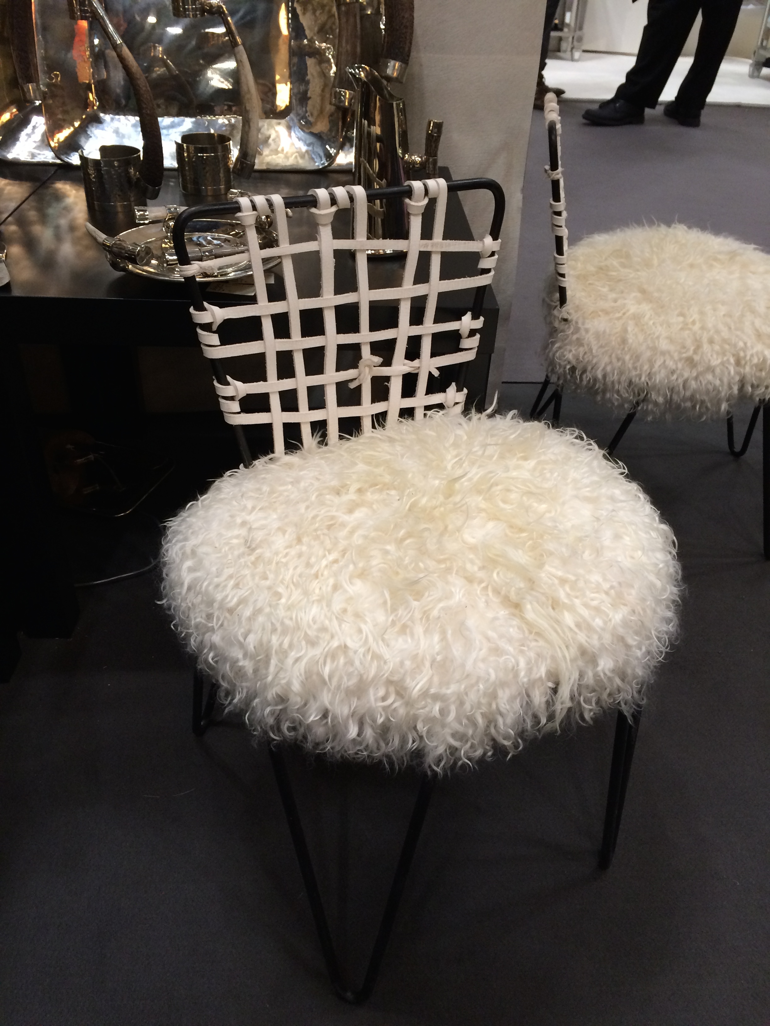
So many great pieces to get inspired about decorating at Highpoint...
Mirrored dining chair with a storage unit that also serves as a platform for a piece of art.

Lighting which includes sconces , Kelly Wearstler's "crystal" chandelier, simple table lamps. I am a sucker for simple lines that make a statement.


See the guy above climbing up the scaffolding. Nice not to be so serious sometimes.
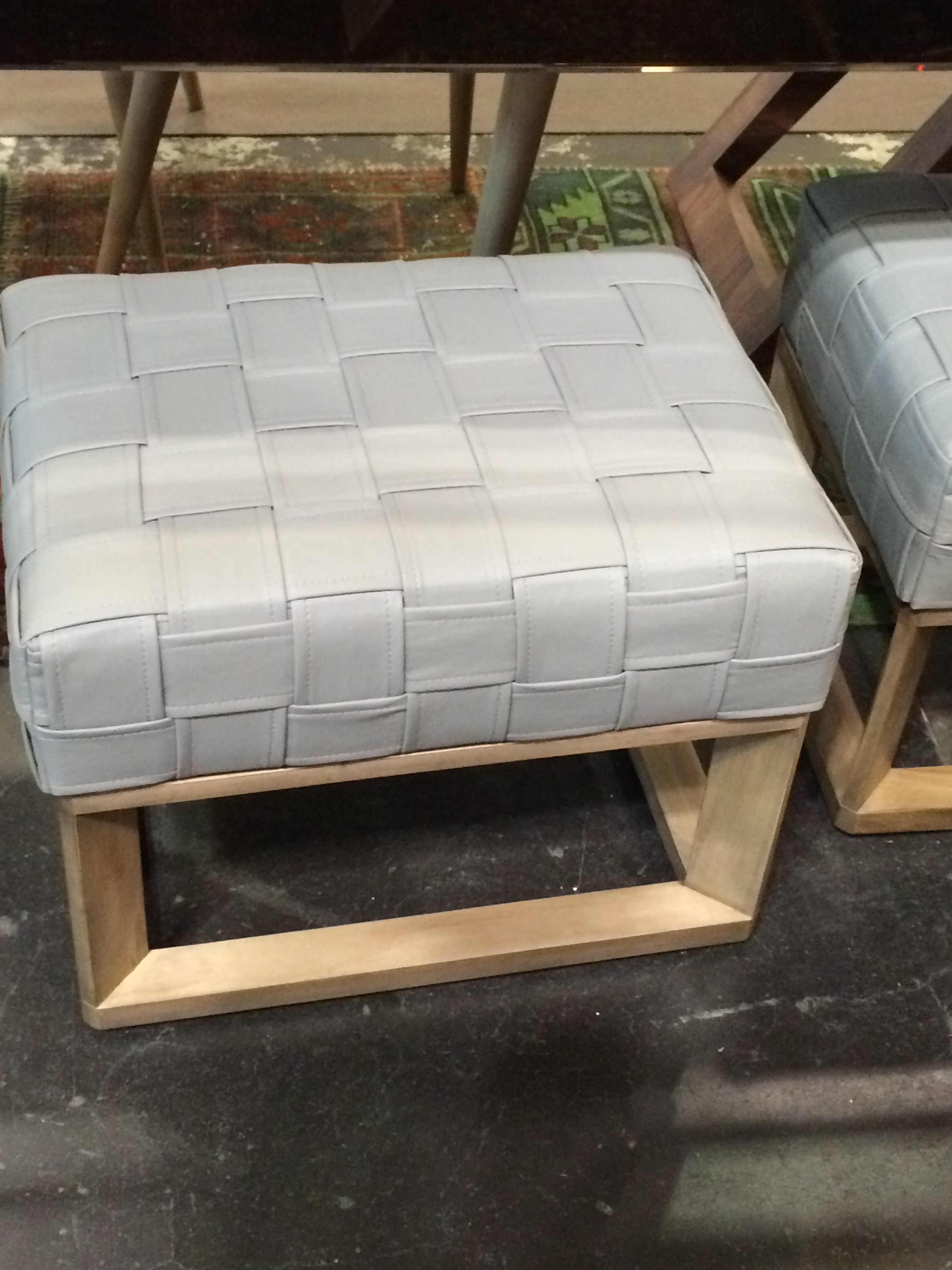
Cool coffee tables


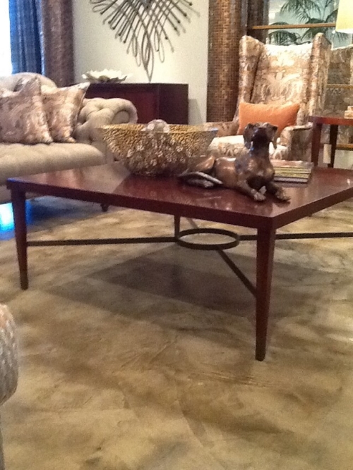
Ok in the above pic, you need to ignore the accessories and upholstery and just look at the simple table.
Also some decorating ideas in terms of window treatments and wall coverings.

In the above pic, the showroom used tape and nail heads to create the design on the walls.

I also liked this window treatment detail in this showroom.

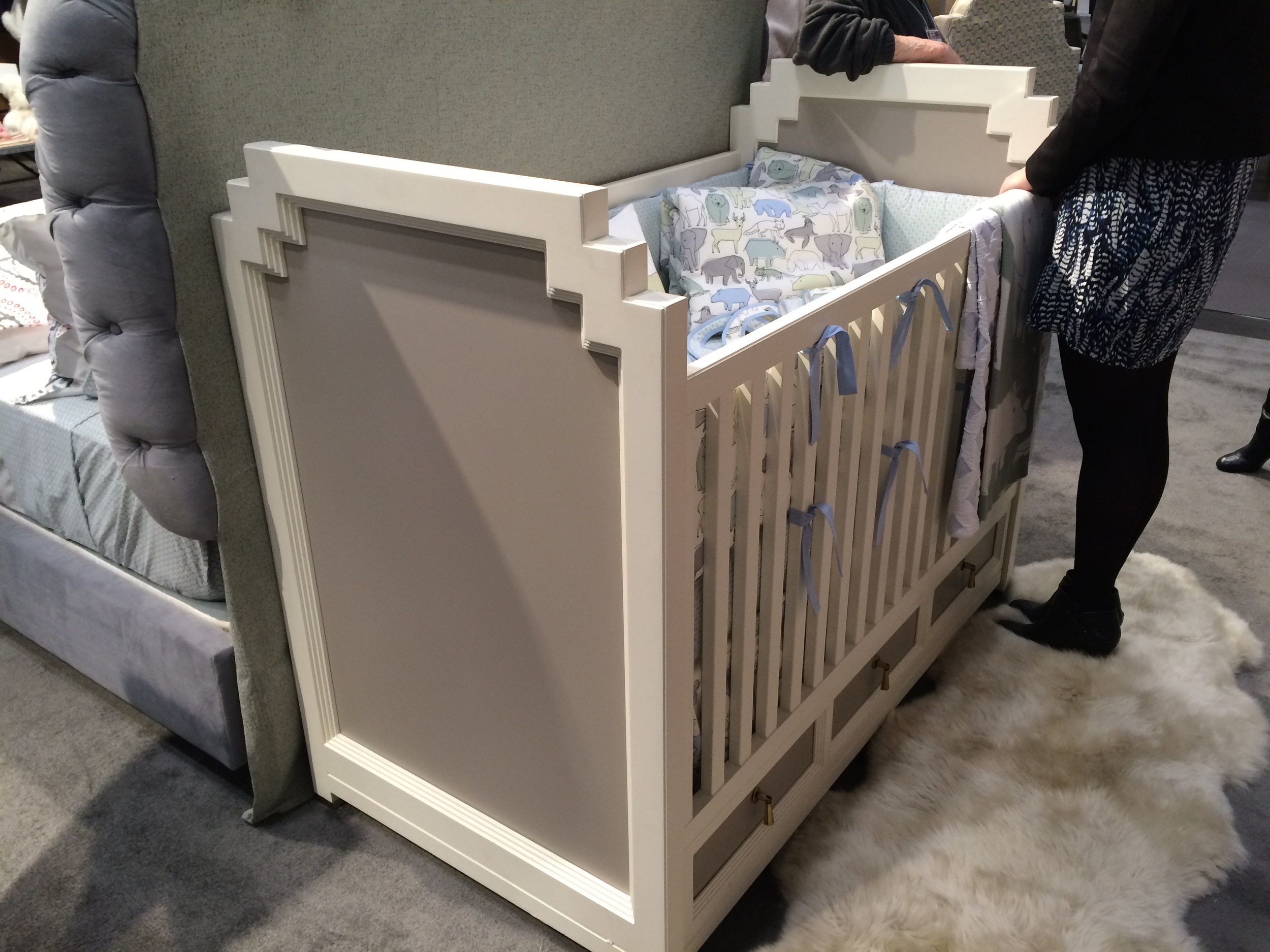
And I can't ignore the children's spaces, the beginning of the decorating journey of Cici Crib Interiors.
Great compact glider for a baby's nursery...

The decorating look may just call for a modern rocking chair- I love this super cool leather one.
And of course art work is just so important. I love these works for a baby's nursery or even a master bedroom. So peaceful.
Too many digital clocks these days. Kids need to practice using analog clocks. Great for a playroom or boy's bedroom.

Cosy seating for a girl's bedroom...
Well that was just a sampling of what goes on at Market. Lots to bring back and decorate in New York and Pittsburgh!
See you...
Christina
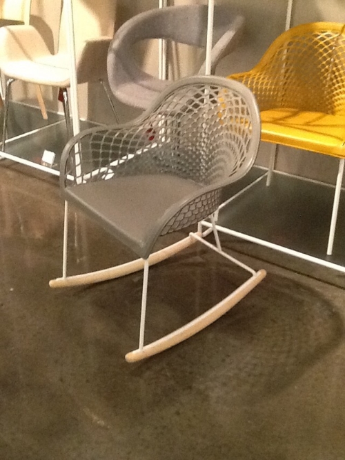
It is always a whirlwind going to Highpoint. One of my main goals is to see new merchandise and trends. Some trends are super obvious and some are my own gut feeling. Everyone was talking about color and exaggerated patterns. But how did that translate into rooms? It seemed like there were two different kinds. Splashy and serious. Rooms seemed to be either male or female. How odd. Rooms for ladies- decorating was glamorous . Gentlemens' rooms were tailored and serious. Both were bold and dramatic. The monotone, gray, unisex was gone. So if you are thinking about decorating your master bedroom into a luxurious, dramatic oasis or your bachelor pad and would like it to be an classic and tailored, there are many decorating ideas to behold..


Bold, bigger than life colors in upholstery...


Take note that the arms on the sofas are getting a wee bit rounded. I think we are moving into a bit more traditional looks. I think we are going to see more toiles and colonial styles make their way into homes in the future. Let's see what the trend watchers say in 2016...

See you..
Christina
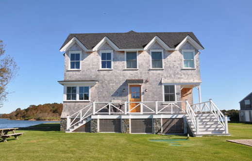
It's finally summer here in Pittsburgh,. I'm so in the mood to head to the seashore. As a summer project I've been asked to consult on the design of the house as well as decorating the interior of a simple Rhode Island beach house. It's a fun summer project. Not much stress- just asked to give my ideas to the architect and pick the interior furnishings for my client to purchase. The client wants a clean modern interior.
The Atlantic was a swirl of green and blue on the day I visited. The rocky beach was saturated in grays and sandy whites. We will use these colors. The house is simple. We will invert the living space, in order to take advantage of the ocean views. Bedrooms downstairs. Kitchen and living upstairs. All finishes will be kept to a minimum. My idea is modern Shaker. Let's see how it will be translated.... Here are some images that we were my inspiration.

A pic from Leslie Architects


I was in Westport, CT a few weeks ago and saw this front door. I loved the simplicity.

My client found these great wooden shutters about 5 feet in length. They are probably from the 1960s. So graphic. They will make a strong statement. They will find a home on the wall in the living room.

We will use this Italian porcelain tile on the first floor for all the sandy feet that will be entering. These porcelain "wood" floors are popular, and extremely practical.

The second wood floor will be painted Benjamin Moore's Buckland Blue. A gorgeous gray blue .

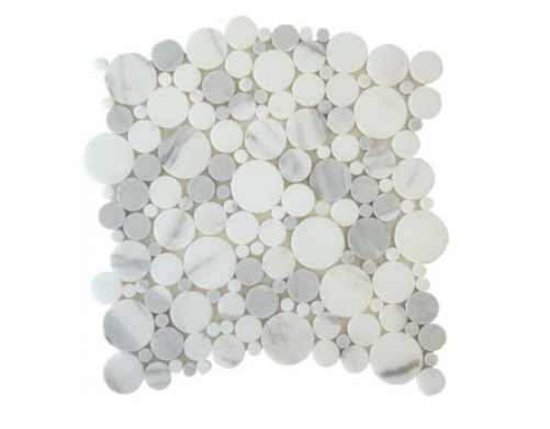
We love this calacatta marble tile for the bathrooms, but yikes it may be discontinued.
That's it for now. There will be more later.
See you,
Christina
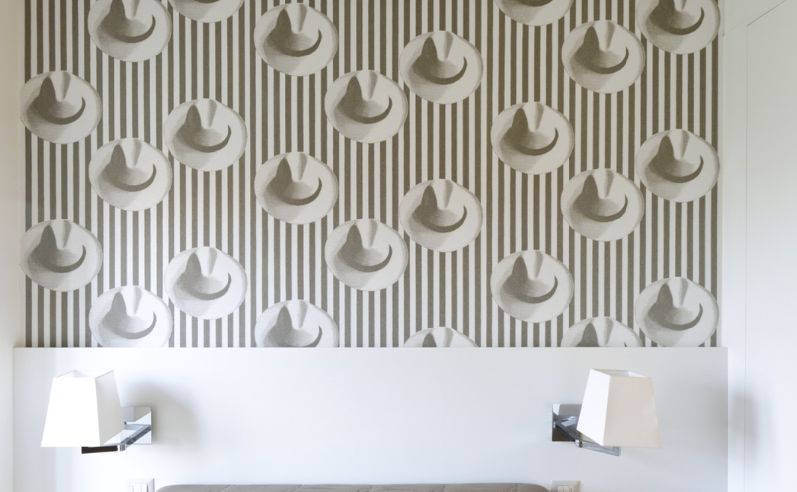
April is the time when new fabrics are rolled out by the most discerning fabric houses. Interior designers were invited to Design Trade in the Strip District to preview the new collections. It was a festive and inspiring time!
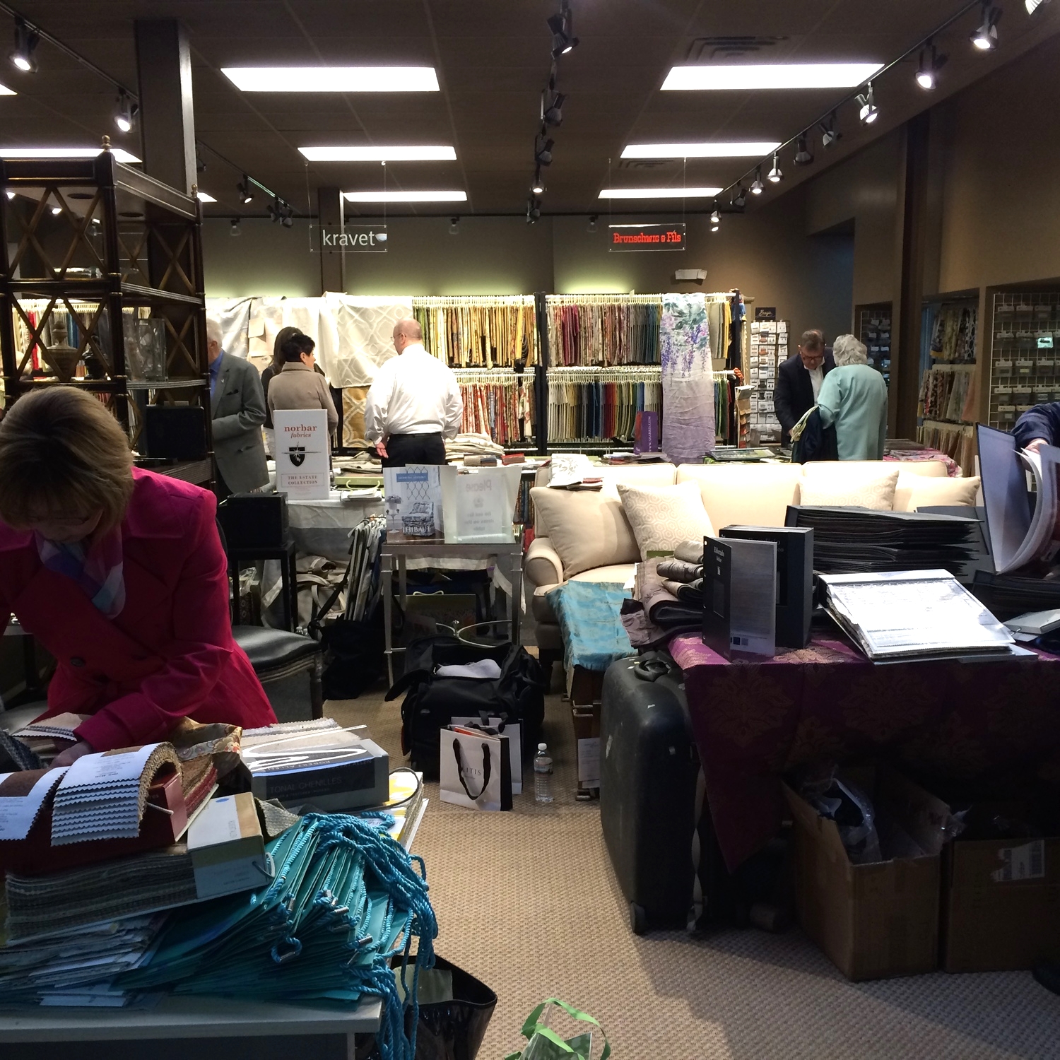
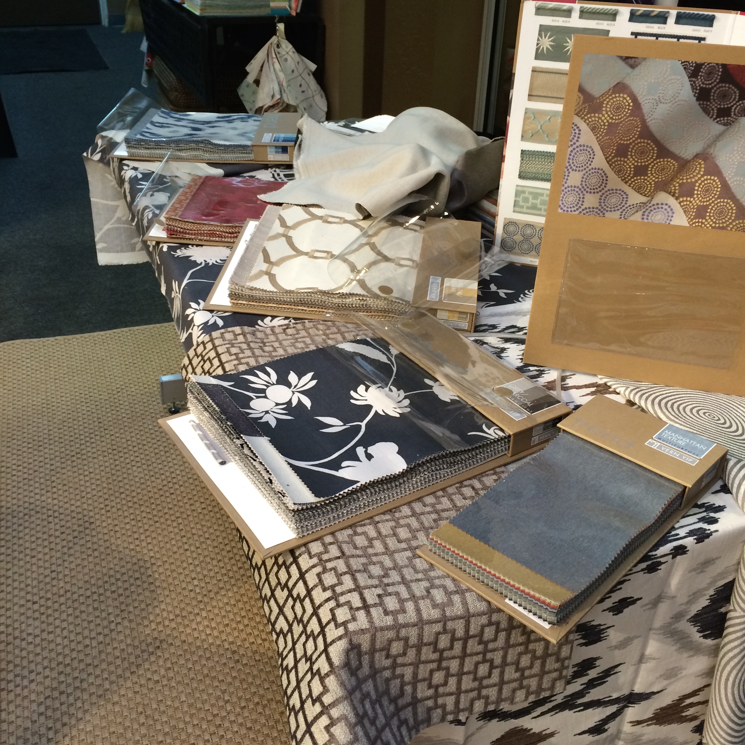
My favorites were from opposite ends of the decorating scale. Classic and clean versus edgy and quirky.
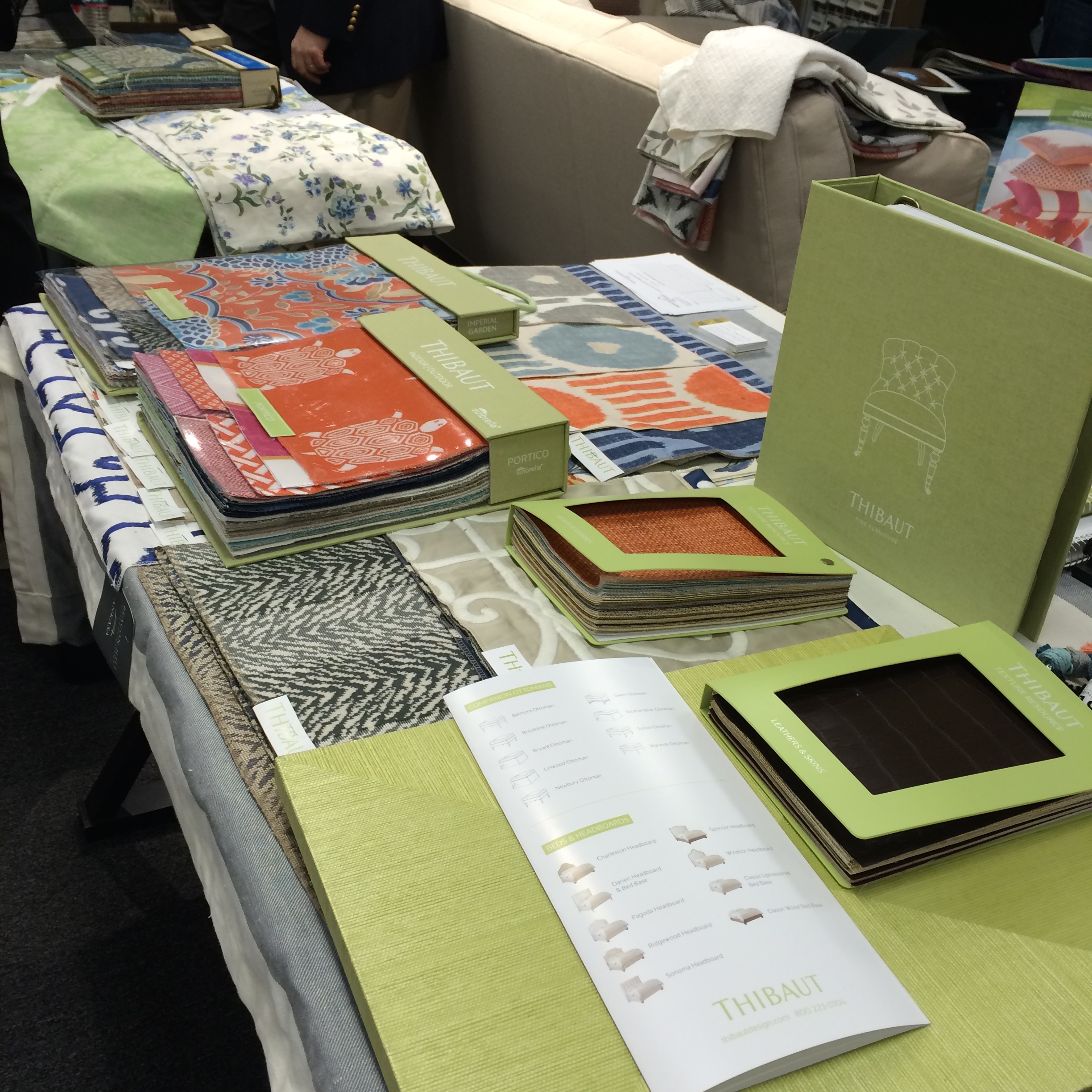
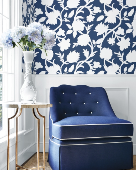
Thibaut showed some crisp traditional fabrics with a twist.

By the way, we were so inspired by the butterfly paper above we decided to use it in a little girl's bedroom as an accent wall.
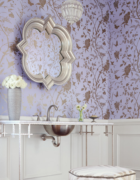
My other favorite from the Spring Market preview was a French company, Élitis. Sometimes highly textured, sometimes three dimensional, and sometimes completely out of scale. Just fantastic. Their coverings work in both both comercial as well a residential environments.

See you,
Christina
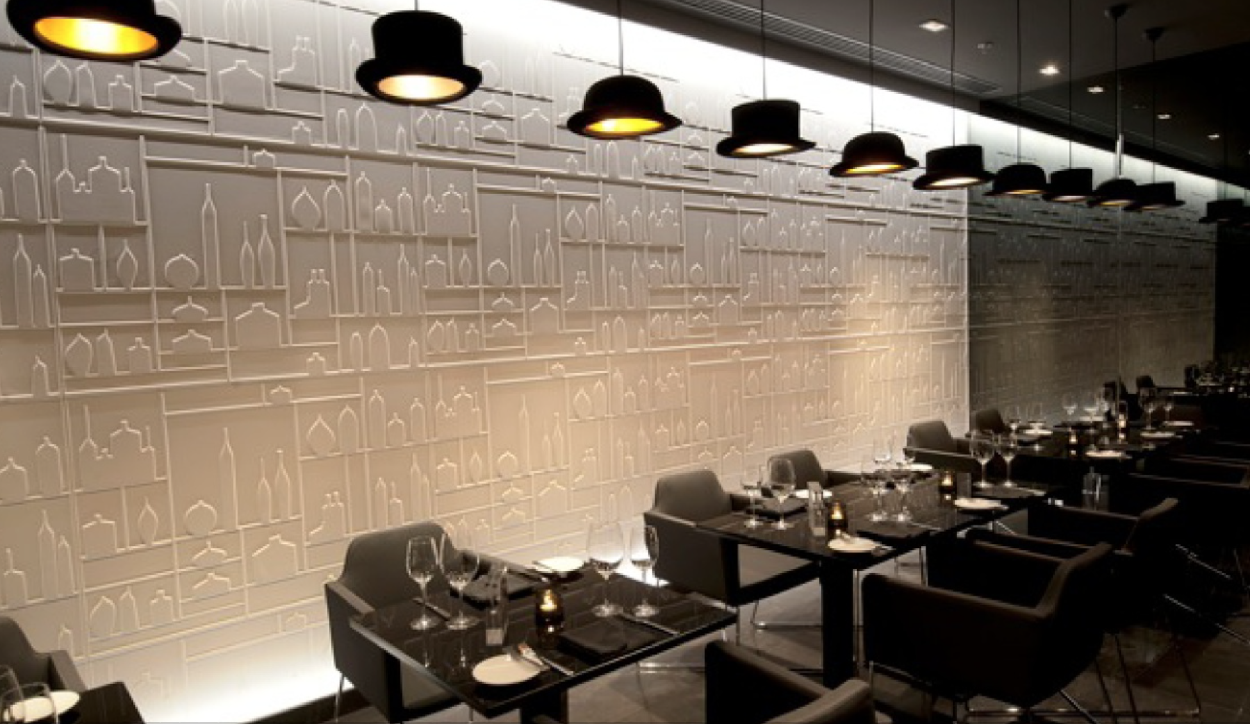
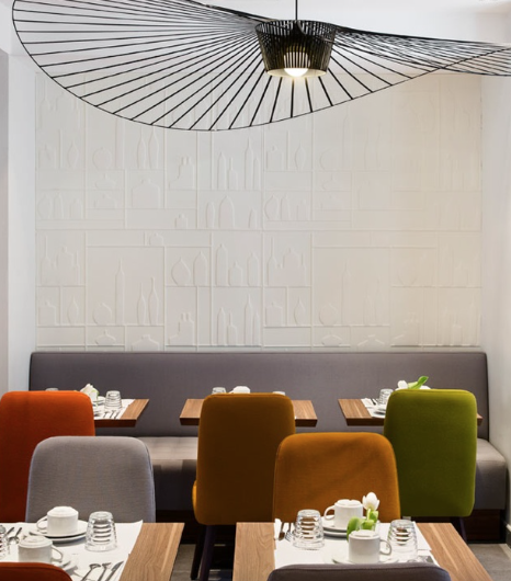
The interior design concept of Senti Restaurant came directly from the heart of the owners. Franco Braccia, a native Italian, spoke of the elegant restaurants of much of his early life in Venice. Annette Ishida, Franco's lovely wife and my very talented sister, helped translate and direct her own ideas into the project. The result is unique and completely fresh. Cozy, modern, quiet conversations, gallery like and drama were descriptions on the design table. They may seem like contradictions, but each idea was incorporated into the final product. So a great shout out to the Trib for noticing Senti's design!

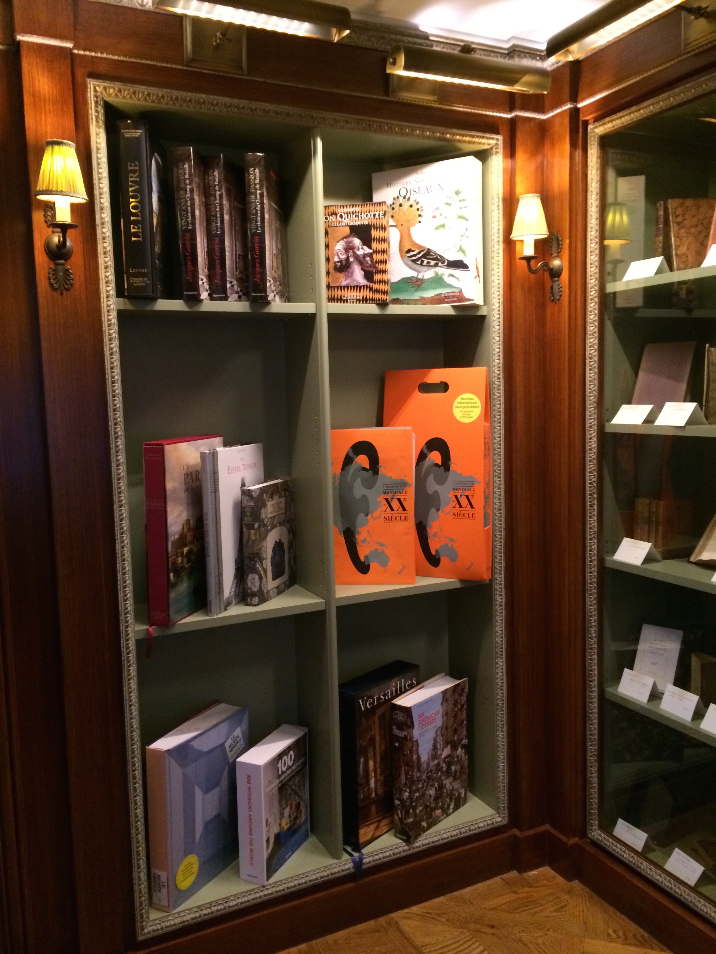
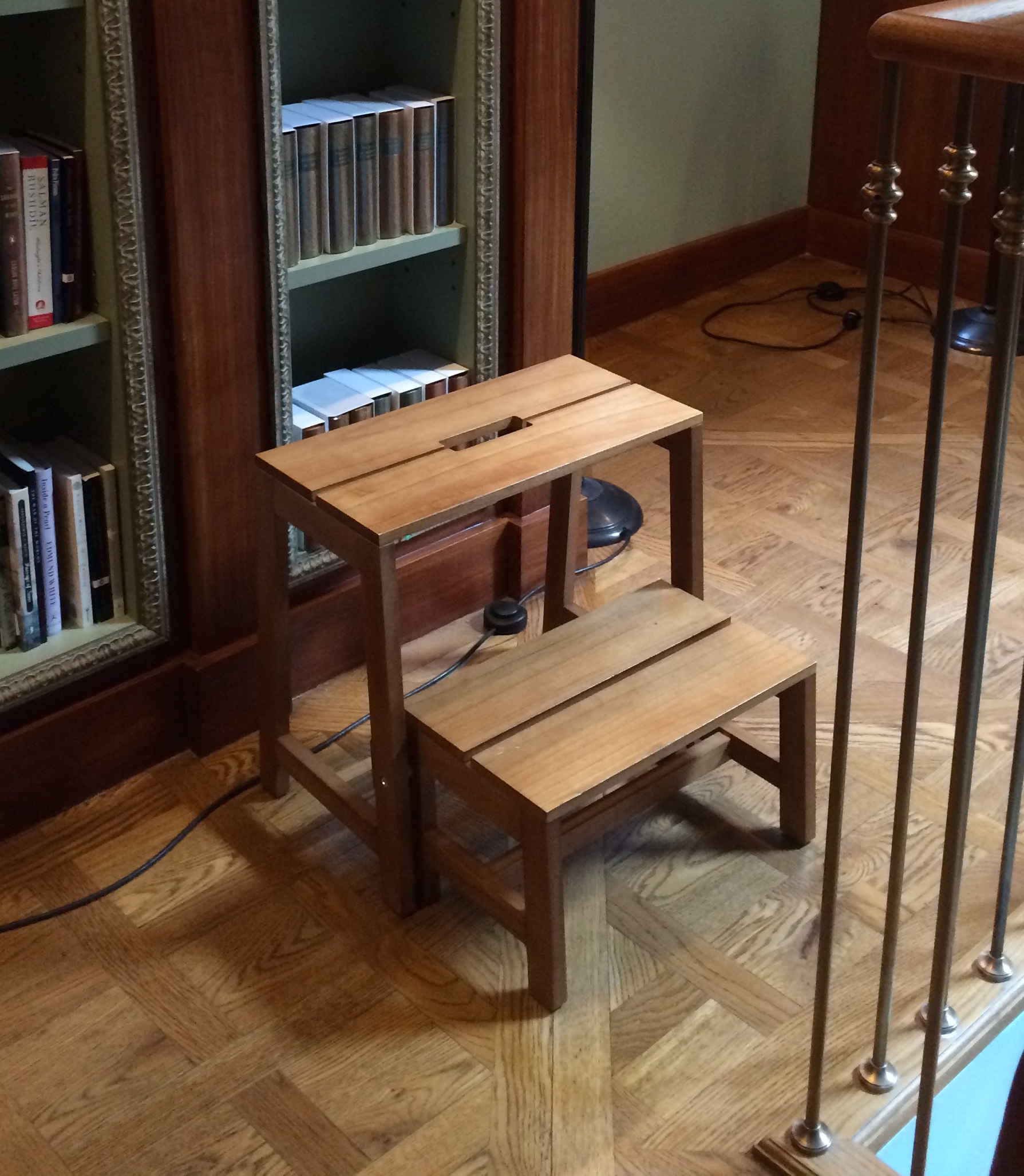
I got a chance to stop into Albertine book shop a few weeks ago in NYC. Located in a Fifth Avenue mansion owned by the French Embassy, I quietly say it was it's interior design that drew me to visit the shop. The space was designed by Jacques Garcia. He totally respects all aspects of traditional French design. But he also adds colors and twists that make the space fresh and unique. Garcia designed a furniture line for Baker which is in that same quirky traditional vein.

There is crazy inspiration for a home library or office in the bookshop. The celestial ceiling, the green interior of the bookshelves, the trim on the bookshelves, the simple step stool, the eclectic mix of modern and traditional furniture.
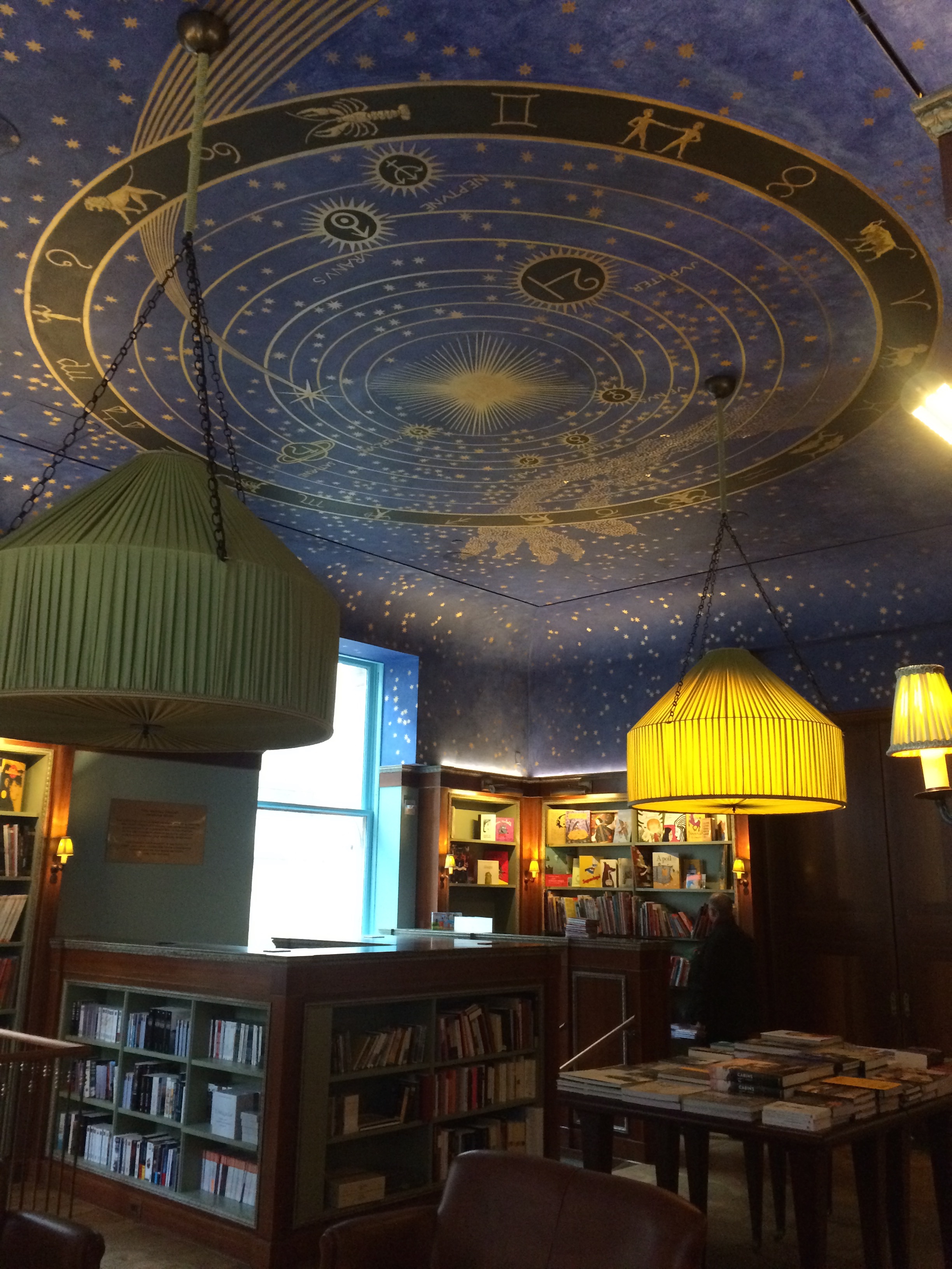
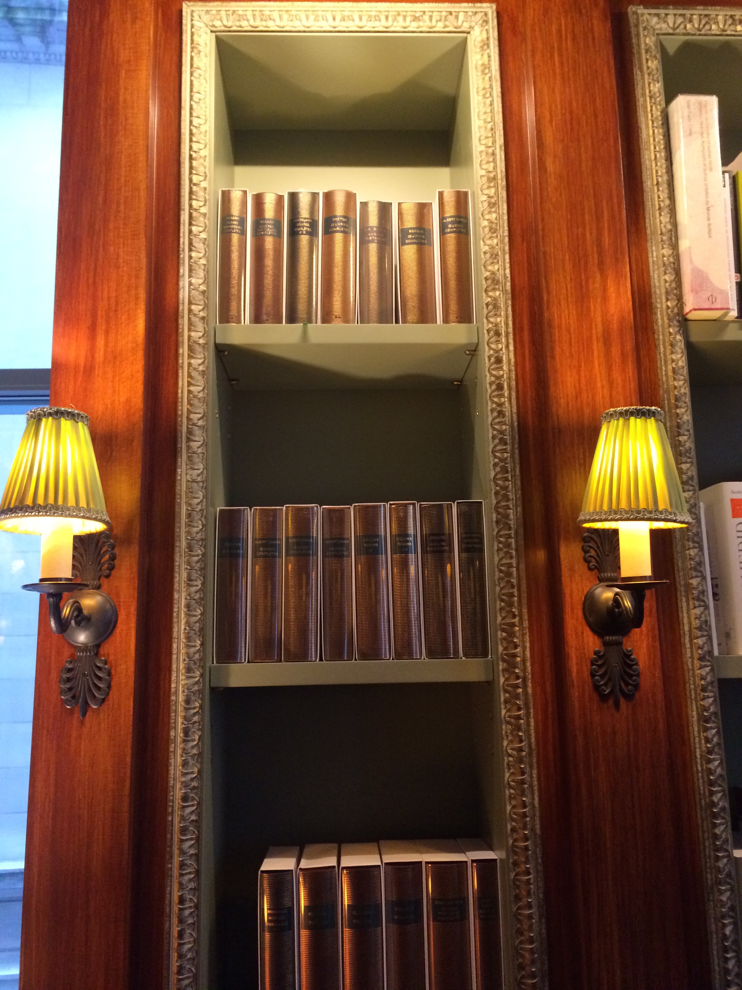
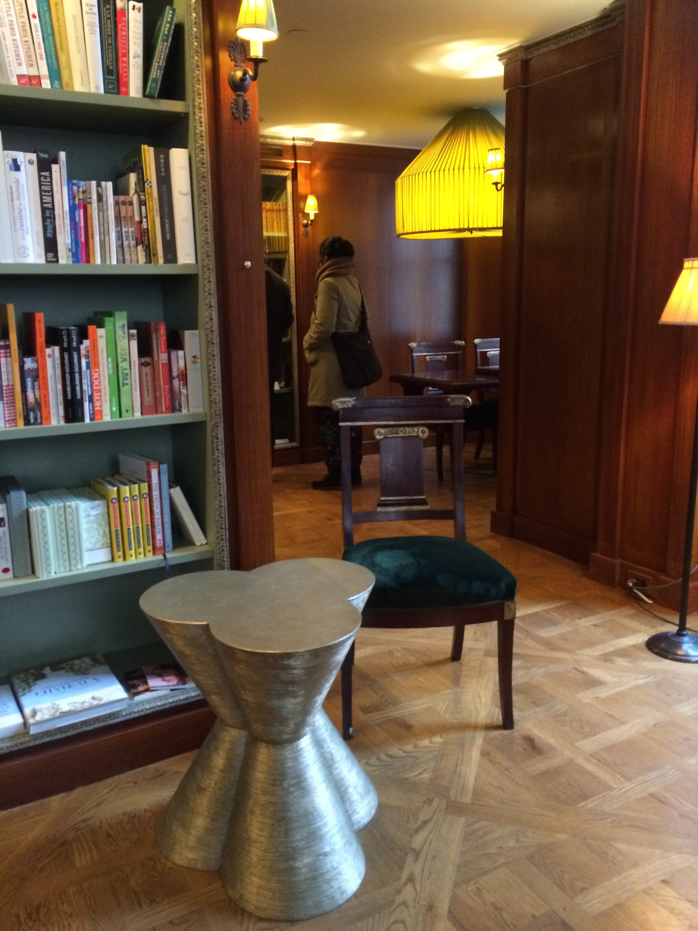
And how can anyone not notice those out of proportion, gorgeous light fixtures. So enormous.

C'est magnifique!
See you...
Christina
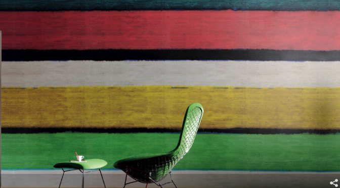
Who makes the most glamorous, finest quality wallpaper? Far ahead of anyone is Phillip Jeffries. You can go completely understated with their soft fabric wall covering or over the top glam with their glowing gold striations paper. We went for the "look at me- I'm gorgeous" in designing Senti Restaurant and Wine Bar. Located in the hippest part of town, Lawrenceville, Senti is special place with special food. More on the fabulous Senti in an upcoming post. Today we celebrate Phillip Jeffries for profiling us in their Designer Installs!

We used the wallpaper at the base of the bar to accentuate the entire area. We wanted it to glow. It has a lacquered look, but it is actually a vinyl paper. Works perfectly!
See you...
Christina
It's always great being in NYC. Now I notice it more than ever after moving to Pittsburgh. So I am back in NY visiting with clients, sourcing new fabrics and furniture and visiting with friends. It was a whirlwind that ended at the NYNOW show. The day was cold and snowy. Definitely reflected my decorating mood. While everyone was talking about color, I noticed all the soft colors and sparkly accessories.
Chunky throws and upholstery for a chic living room
Monochrome colors in Art . Decorating for several spaces- A quiet physician's office, a young hip couple who embraces Andy Warhol's birth place of Pittsburgh, to a a classic mom's NYC master bedroom.

I'm always on the look out for what's new in baby nurseries. Great crib and a funky big sister's chair.
I would love these dishes for my new place in Pittsburgh.

Last stop was this Japanese vendor who has the most delicate little loves. A mobile of sorts. Time to fly home..

See you...
Christina
...to the High Point show in North Carolina! I am so excited, as always, to go and see the vast array of furniture and ideas! I'll be coming back completely inspired, so be sure to check this blog for all the photos and new ideas! Here are a few companies I know I will be visiting:

Hickory Chair

Mary McDonald

Chaddocks
So much gorgeous design to explore! (like a kid in a candy store! ;)
*C


Nothing we love more than creativity!
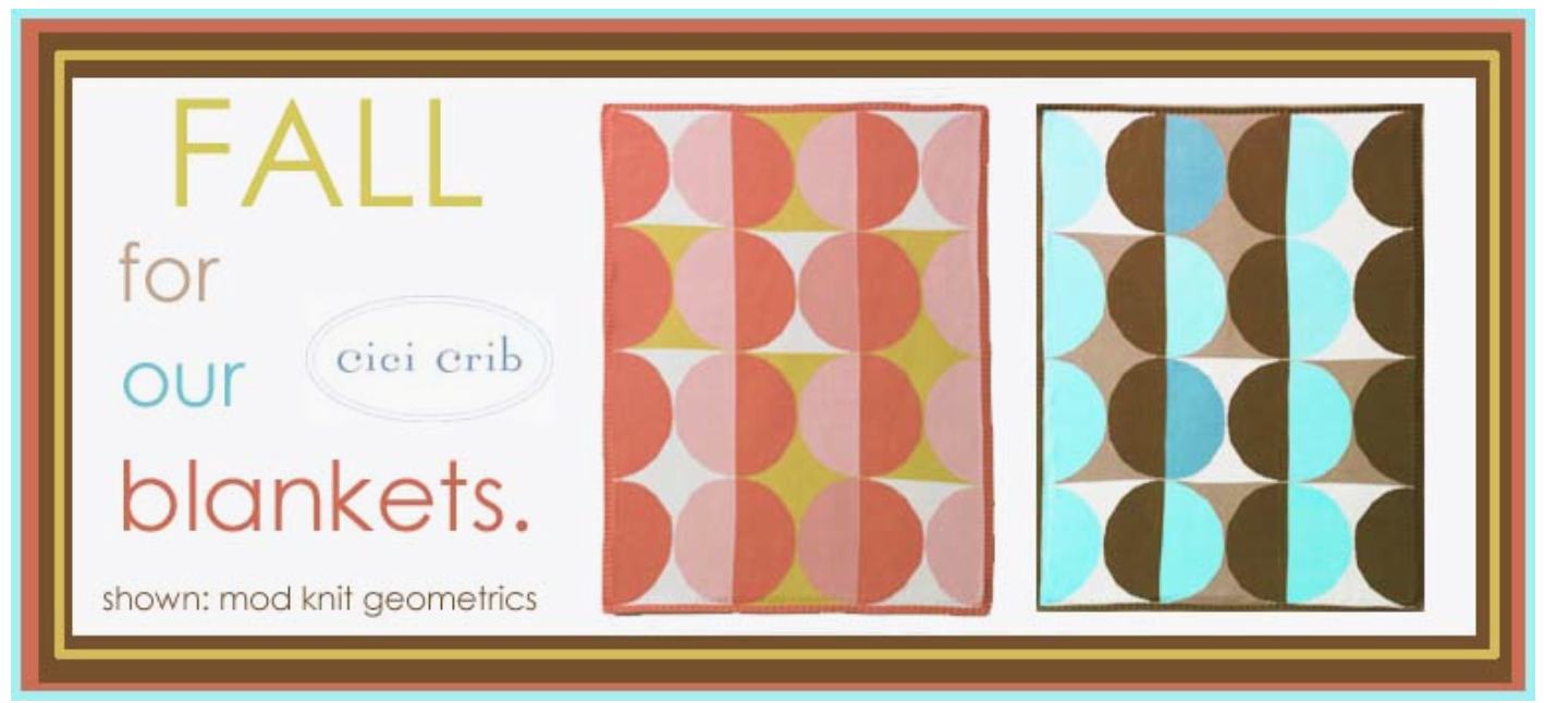
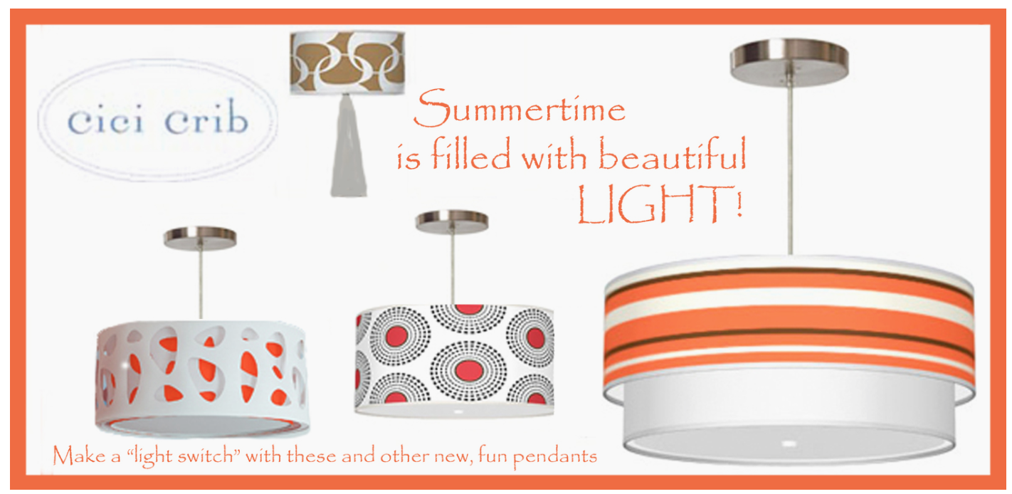
New Website, new logo, new Cici! Yes, we still have our precious baby items that you love and we still decorate nurseries, but we found our clients have begun to ask what we can do for the rest of their of their "cribs".
There is nothing we love more than continuing the visual story throughout the rest of the house, turning it into a home that speaks of the homeowners' personality.
We hope this new blog will inspire you, as we visually record all the amazing design and decor ideas that catch our attention and give us food for thought as we expand our creative endeavors!
Join in on the ride!
I will be taking some time off from blogging. Time to reflect after all that has happened in Newtown, CT. We are not so far away from Newtown. It could have been our town.

Owner of Armonk Wines has a kindergartener at Sandy Hook Elementary school. People have been asking how to help. In partnership with the PTSA, Sandy Hook Elementary School a fund has been established to help defray the enormous cost of moving a community to a new school.
Have a safe and peaceful holiday..
Christina
I was able to see the Beatrix Potter Exhibit at the Morgan Library last weekend. A very nice respite from all the chaotic crowds of the city.

Beatrix Potter's childhood seemed isolated. Her parents were wealthy and quite stern. Her happiest moments were spent at the family's country home, where she would spend hours observing animal behavior. Lucky for her, she was allowed to have a menagerie of pets- cats, dogs, rabbits, snakes and mice, oh my...

Most of her book ideas came from stories that she wrote to the children of her governess. Her gentle and delicate drawings were full of imagination.


The exhibit is so worthwhile- there is also a spattering of toys and other items related to Beatrix Potter.

Too bad Peter wasn't around to make a muck of things...

See you...
Christina
Armonk is home to Frosty the Snowman! Writer, Steve Nelson was a long time resident. It is believed that the traffic policeman in the song is based on a local cop, John Hergenhan. Frosty is a classic that has been around for years. Love these vintage pics...


Join us Saturday December 8th as we celebrate Frosty the Snowman!!

See You...
Christina